Fonts are everywhere. Every single online word has a font associated to it. Whether we’re designing something new or are modernizing old artwork, there are millions of fonts to choose from. I currently have over 2000 fonts installed on my computer, to the point that I’ve broken the font list on Illustrator and can crash paint applications just by opening the font menu. However, while there are so many fonts, there’s also a selection of fonts that I like to back to, which look nice and professional.
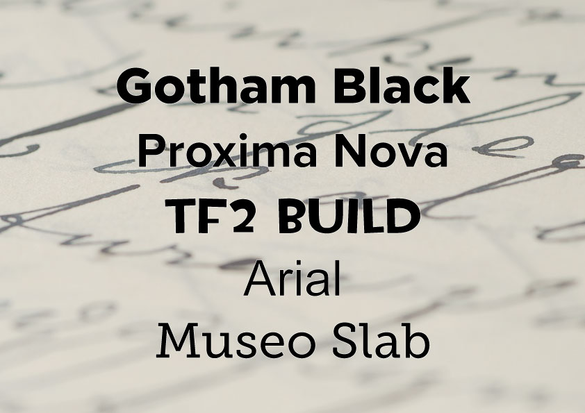
Gotham
Gotham is the font we use for our official artwork. It’s a bold sans-serif font (i.e. it doesn’t have little tails and nooks on the edge of its characters) and there are plenty of different options, from ultra thin to ultra black. From this massive family of font styles, you get a very strong and bold font, no matter what styles you pick. Gotham stands out from the crowd quite nicely. Gotham Black is what we use a lot for our own branding, so we definitely like this one.
Proxima Nova
At first glance, Proxima Nova looks very, very similar to Gotham. At least, the lower case letters do. But this sameness actually comes in very useful. You see, Gotham doesn’t have every single character. If you want to type in Greek, for example, then you can’t, there are no characters or glyphs to do so. However, Proxima Nova has a lot more accessibility, and also has characters for Greek, meaning I can happily type away in Greek without any issue. It also has Russian characters too, as well as a few handy glyphs like copyright and trademark symbols.
TF2 Build
When it comes to cartoony fonts, there is a lot of choice out there. Okay, sure there are a ton of choices for all types of fonts. But cartoon fonts need to be very closely designed, so that they’re both not too cartoony but also immediately legible. Many fonts go too far on their curves and serifs. However, the TF2 Build font stands out. It’s actually the font for one of my favourite video games, Team Fortress 2, but I’ve seen it plenty of times elsewhere. I also tend to use TF2 Build for personal stuff, as I love how the capital letters are all slanted differently. Sadly though, there’s no lower case version of this font. Which is a shame.
Arial
As far as I’m concerned, Arial is a good font. It may be overused, but it’s a nice, strong sans-serif font. Everyone has Arial and its use is widespread across a vast ocean of languages, including Greek, Russian and Hebrew. On top of that, it also has hundreds of different glyphs, including copyright symbols, things like hearts and diamonds, tiny letters and letters with all the accents and tones you could ever need. Arial is definitely a workhorse when it comes to fonts and typing, and it does deserve recognition.
Museo Slab
Serif fonts are hard to get right. There’s so many different ways you can add little flicks and tails to every letter. Matching a serif font can be very difficult due to how letters like g and p are stylized. But when it comes to Museo Slab, you get this nice, heavy font. Even when not bold, Museo Slab has quite an impact, and stands out compared to more traditional serif fonts.
Of course, there are TONS of fonts out there, and many fonts that I find myself using all the time. Narrowing it down to five top fonts was a struggle, but these fonts are ones I use daily. But it’s worth remembering that there’s a font for everything. You just need to find it…