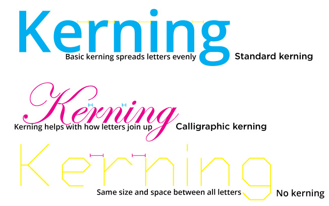
Kerning is the process of adjusting the space between characters in a font. The goal of kerning is to create a visually pleasing and consistent spacing between characters, so that the text is easy to read and has a professional appearance. Kerning can greatly affect the readability and aesthetic of a piece of text, and is thus very important.
Traditionally, kerning was done manually by typesetters, who would adjust the spacing between characters by hand. Today, kerning is often done automatically by computer software, using algorithms that take into account the shape and structure of each character. Some software also allows for manual kerning, giving designers more control over the spacing of their text.
Kerning is different depending on your text. Headlines often require more kerning than body text, as the larger font size makes the spacing between characters more noticeable. Captions and other small text also require careful kerning, as the small size of the text can make it difficult to read if the spacing is not consistent.
In summary, kerning is the process of adjusting the space between characters in a font to make the text more readable and visually appealing. It is an important aspect of typesetting and graphic design and dramatically affects how text looks.